Posts

Extra Credit

Image
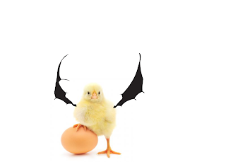
Artist Statement: For this project I wanted the images I combined together to be somewhat related but a combination that was fun to make. I used bat wings and combined them with a little chicken and with the image trace tool I wanted to take the original bat wings, separate them and put them on both sides of the chicken to make it seem like the wings were on its back or that it had wings in the first place. This took around an hour to make.

Ethan Cook Portfolio.

Image
  Closing Statement: This semester with digital media has been an interesting one to say the least. As a class we went over some many skills and programs which were very interesting as a beginner with adobe programs. My favorite unit was the illustrator one for sure because that unit was the most detail oriented. In general digital media was a very interesting course to take in my opinion due to the interesting skills you learn with the adobe programs and the unique skillset you learn from the class. I generally enjoyed everything this class had to offer because it also made me have a bigger eye for detail and how I can always improve any content I make going forward.  

self portrait

Image
Artist Statement: So for my self portrait I wanted to go for a simplistic route so I decided to make the self portrait in a way where you can see every detail. I even made the gradient by my nose and a part of a wall since the lighting of the photos were on the photograph as well.

Business cards

Image
Artist Statement: I decided to go with a simplistic look for this project. I wanted to go for a simple front with my logo but with a different color set because I thought it would pop more. My back is simplistic with my contact information since I know that simplicity and being to the point is very effective and not doing to much with business cards is how it is today.

Logos BW and Color

Image
Artist statement: For my logo I really wanted to add the aspect of Duality since I've always been a fan of duality in any sort of media I've ever consumed so I went with using fire and ice as the duality of my logo because it is known that they are the very opposite of elements and just about the opposite when it comes to everything. I then decided to put a yellow line between them with a circle to give it a more professional look. 

Gradient Mesh

Image
Artist statement: So for my gradient mesh I decided to use a picture of an apple and I really tried to be very detail orientated with this project especially with the wonderful gradient tool by trying to match the color of the apple to the point where you can the the shadows of the fruit are and where the part of the stem is. I had a blast with this project with the gradient tool.

Calligramme

Image
Artist Statement: Here is my Calligramme I got inspired by a cruise ship for this project so I decided to make my object look like an anchor and I decided to make the poem about the holidays because the holidays have always been an important time for me.